No fly's on us, eh?
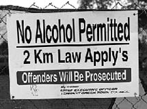
No matter what your ideas are on design
aesthetics or typography, there are two fundamental requirements for
public signs. They must be readable and they must be spelt correctly.
The new signs appearing around town fail this basic test.
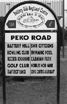
The sign outside the Westpac bank in Peko road is a particularly unfortunate
piece of work. The words are all different widths, some so jammed up
as to be impossible to read and even with this brutal spacing the lines
still manage to end up different lengths. It looks like the result of
unchecked computer technology gone feral.
No amount of talk about 'best practice' and other modern catch-cries
of management will count for much if we fail to maintain the basics
of written language.

